


Introduction
Edward Hopper is one of my favourite painters. And I must say that I am myself surprised to say so.
If you have read my previous articles, you will realise that I like it weird. After all, isn’t the whole point of this site to review and analyse bizarre works? Well, Hopper’s works aren’t bizarre, so why analysing them here?
For some reason I’ve still not fully comprehended, Hopper’s paintings have enchanted me from the moment I set eyes on them for the first time. This attraction was different from what I felt when appreciating a good surrealistic work, which is what I’m usually passionate about.
But clearly, Hopper isn’t a surrealist. His paintings are, in fact, quite realist – that’s his style, realism, which you may argue is quite the opposite of surrealism.
Nighthawks in particular looks like a rather mundane scene with few extraordinary elements that necessitate any exhaustive analysis. However, I have little doubt that most people feel there is simply something enigmatic about this painting.
In this article, I set my mind to exploring why that is.
Review
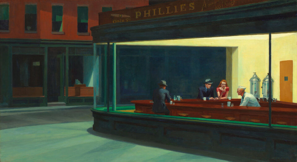
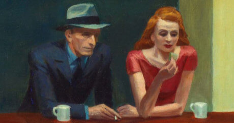
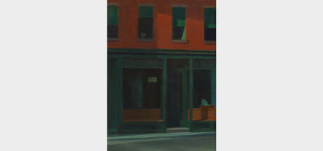
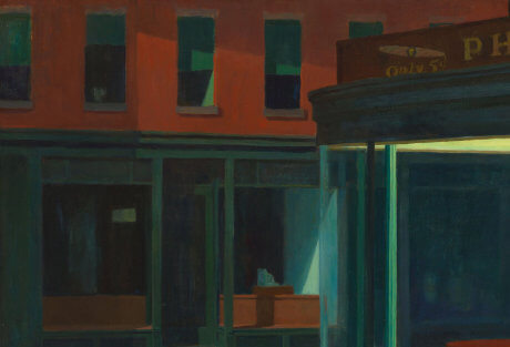
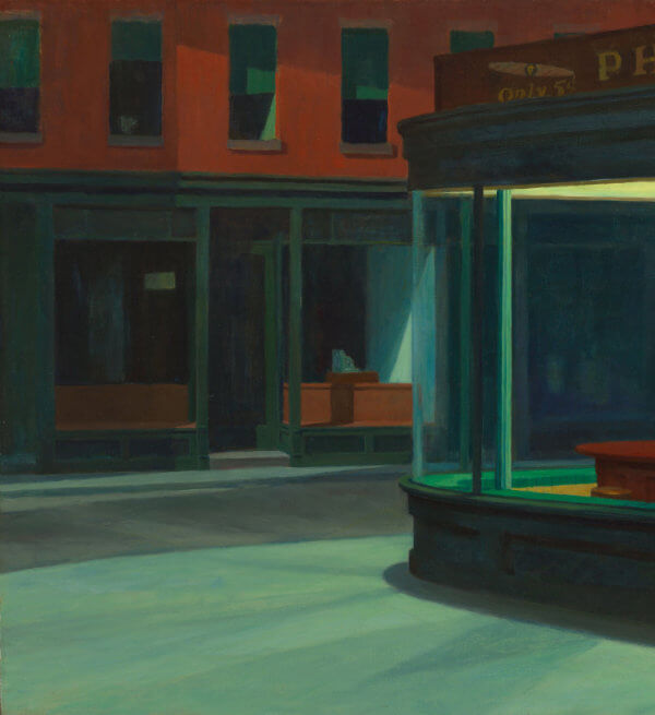
Nighthawks’ central element is a well-illuminated diner located just around the corner of an otherwise deserted and unlit street.
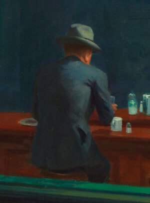
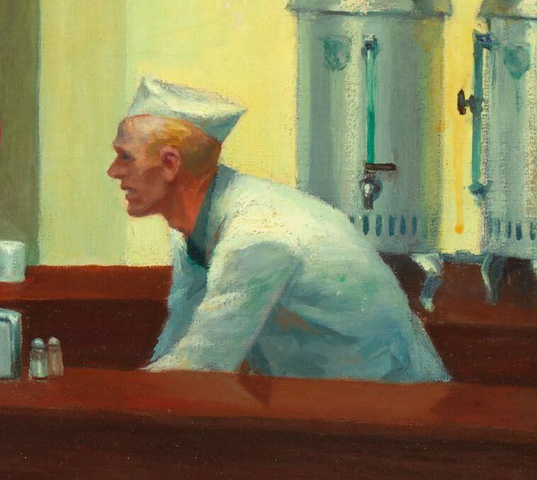
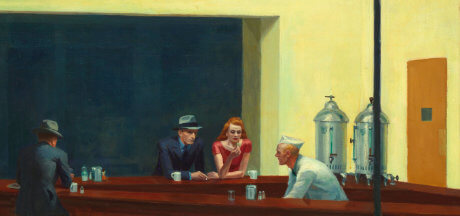
Inside the diner we see three customers and a waiter. One of the customers appears to be a middle-aged man seating alone and with a glass in his hand. The other two customers are a man and a woman seating next to each other but clearly lost in their own thoughts. The waiter is the more active of the four characters and appears to be cleaning or preparing a drink. Facial expressions are not sad, not happy, just tense, and apprehensive.
There is also a certain dynamism in Nighthawks; it’s almost as if we can witness not just quietude, but also motion inside the diner, as if a story is unfolding. This fits Hopper’s intention not to provide viewers with an explicit narrative, but encourage them to make one up themselves.
Technically, I find the painting to be of an ineffable mastery. Hopper was an incredibly meticulous painter; before embarking on any project, he would make innumerable sketches and studies of people, lighting, and perspective. I greatly admire this in painters and Nighthawks epitomises Hopper’s tenacity for producing few but superb quality works.
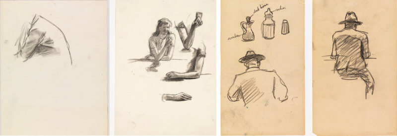
Fortunately, most of the preparatory material for Nighthawks has survived (at least 19 sketches, but probably many more existed) and give us vital clues about the artist’s working method.
The first thing to notice is that the painting is immaculate and very smooth; every stroke appears to have been purposefully placed on the canvas. This is the result of Hopper’s painstaking analysis and research on the subject matter, only transposing the elements onto the canvas once he was satisfied with the result of his studies.
Nothing was left to chance. In his sketches we can see how he approached some of the elements in Nighthawks, not neglecting any of them but giving them equal importance. For example, the hand of the woman, the distance between the couple, the back angle of the lonely man, the various objects on the counter, the coffee bins, the clothes, facial expressions have all been carefully studied by Hopper.
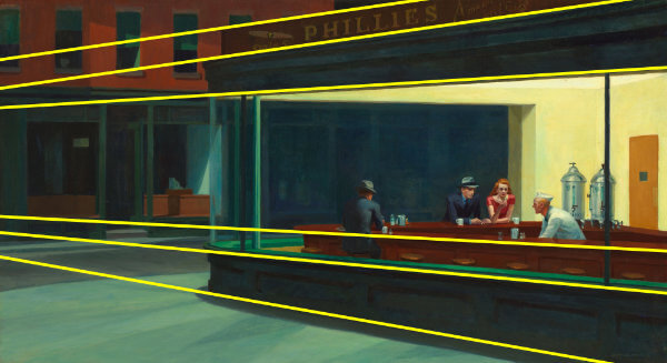
The second important aspect of Nighthawks is the way Hopper made use of perspective. Note the clever use of long diagonals lines and how they seem to converge somewhere off-canvas, giving it a feeling of continuity outside the painting. There is also a certain harmony in how these lines run “along” the lines of the counter so that the whole painting just feels right.
The perspective is from someone approaching the diner. It’s interesting there is no door, but a rather large window accentuated by the bright yellow lights. It is this combination (perspective + lighting) that seems to invite passers-by to inevitably peer, in a sort of voyeuristic interest, into the diner.
Finally, the lighting/colour contrast is particularly ingenious. It’s night outside, there are no street lamps or any source of illumination whatsoever. The only vestige of light outside the diner is the one emanating from the diner itself, timidly suffusing the outside street. Hopper achieved this by using darker and paler tones of red and green colours as opposed to vibrant and bright yellow in the interior of the diner.
The stark contrast of light and colour is, in my opinion, what produces the eerie mood that imbues most of Hopper’s paintings, Nighthawks inclusive.
Our rating
Oh boy, what a painting! Really, who would have thought that such a mundane painting of a diner would bring about so much feeling? Seriously, think about it: if you didn’t know Hopper and I told you of a painting of an all-night diner with four people inside, would that really have spiked your interest?
Hopper used everything in the right amount: number of elements, facial expressions, colour, shadow, perspective, lighting.
Despite depicting a few elements within a simple setting, the painting is full of contrasts: a daily and typical scene contrasted with an eerie atmosphere; vibrant colours in the diner contrasted with darkness in the street; lifeless outside the diner contrasted with alive elements inside of it; people physically close contrasted with tension among them, and so on. The viewer is quite cognizant of what he/she is seeing (really, a painting of an all-night diner), but is well aware that something is off.
And all of that without placing a single surreal element onto the canvas. Brilliant!
Of course, 5 stars!
Bizarrometer
This is an easy one: Nighthawks is not weird at all.
There are no surreal elements or elements out of place. Sure, there is a certain eeriness that I find indescribable really (which is the reason we are reviewing it) but there is nothing in the painting that requires explaining.
For this reason, Nighthawks gets a rating of 0.5 in the Bizarrometer.
Nighthawks (briefly) Explained!
Most interpretations I’ve read about this painting revolve around the idea that it represents human isolation. This interpretation gains credibility when we consider that Hopper painted it 1942, when the world was at the heist of the Second World War.
Rationing, longer working hours, millions of people overseas, and a general apprehension that war could be brought to the US meant that people restricted social events (e.g., frequented less diners) than they used to prior to the war. Furthermore, blackout drills were the norm in New York at the time, and lights were often dimmed in public spaces, further discouraging people from remaining outside for long hours at night.
However, Hopper emphasized that he did not purposefully infused this painting with themes of loneliness or emptiness, although he did acknowledge that “unconsciously, I [Hopper] was painting loneliness of a large city”.
He also is reported saying: “So much of every art is an expression of the subconscious that it seems to me most of all the important qualities are put there unconsciously, and little of importance by the conscious intellect”.
Running the risk of sounding like a broken record, had Jung heard of Hopper’s cogitation he would have been thrilled, for Jung believed that works of art, in general, were nothing more than unconscious influences surfacing to the artist’s minds (read more about Jung’s dream theory in this article).
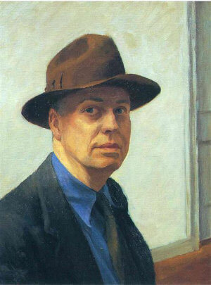
Another potential indication that Nighthawks is a portrayal of human isolation, is Hopper’s apparent tendency for depression and isolation.
Hopper had always been an introvert individual from an early age, and distanced himself from social events. There is even an audio recording of Hopper saying “It’s probably a reflection of my own, if I may say, loneliness. I don’t know. It could be the whole of human condition”.
The human figures in Nighthawks appear reclusive, apathetic and generally tense, each of them perhaps depicting Hopper’s recurring melancholy. As I will explain in detail below, the man seating alone in Nighthawks could be Hopper himself (the idea of the man seating alone might have been inspired by a character in Hemingway’s short-story “A Clean, Well-Lighted Place”).
Furthermore, Hopper had a difficult relationship with his wife Josephine, who served as model for the women in most of his paintings, including Nighthawks. Strangely, she is distant from Hopper (the man seating alone), which could be an (unconscious?) indication of his feelings regarding their relationship.
Before a more detailed analysis of this painting, let me share with you some facts I learned about the mood in the USA when Hopper painted Nighthawks.
I’ll also summarise Ernest Hemingway’s short story “A Clean, Well-Lighted Place”, which, I believe, lent Hopper the idea for the characters and setting in the painting.
Masterpiece
Perfect
This is a really good analysis of Hoppers artwork Nighthawks. I would like to know how did you collected so much information like his sketches and the comparisons you make with different components of the artwork. Im trying to make an analysis about Gustave Caillebottes artwork “Couple on a walk” and I don’t know how to begin or where to find information. I please ask for advice and tips. And good work, I was inspired!
Hi Carla,
Thank you for the kind words.
I think the best advice/tip I can give you is that you should diversify the materials you use as much as possible. For Nighthawks I read the Taschen books, online reviews/analysis, forums, and watched YouTube videos. I must have literally read/watched dozens of these analyses before even beginning writing up this article. I must admit though that it did help that Nighthawks is such a popular work, and that so much have already been written about it. Essentially, I just had to compile all this information and condense the relevant parts into an article (with a personal touch of course :D).
To give you some examples, I found out that Hopper was a big fan of Hemingway, and a quick online search revealed that he was particularly fond of the short stories (Wikipedia also mentions it). I then decided to read Hemingway’s short stories and, personally, found Nighthawks to resonate more with “A Clean, Well-Lighted Place”. You also mention Hopper’s sketches. I believe I got the idea from one analysis of Nighthawks I watched, then looked online for his sketches, and concluded that Hopper was indeed very meticulous based on how much of this preparatory work he had produced before he started the painting.
After this initial research, it really comes down to how you want to present the information you’ve collected. That bit is your personal touch, and it is, arguably, the most fun, since you can really unleash your creativity. I like to believe that there is no right or wrong here, so don’t shy away from adding your personal views/interpretations, even if it sometimes feels “overinterpreted”. In my view, readers can always decide which part(s) of your analysis they find appealing even if they don’t necessarily agree with your analysis.
Importantly, you should always try to verify your sources. There is so much information online that it may be difficult sometimes to ensure the information you read is accurate. Ultimately, it’s up to you to decide if a particular source is trustworthy or not, but citing your sources will allow readers to evaluate for themselves their authenticity.
I hope this information helps. If you eventually end up writing up the analysis of “Couple on a walk” do please share the link, I’d be definitely interested in reading it!
Good luck!