

Introduction
Pablo Picasso needs no introduction. The prolific Spanish painter produced over 50.000 works, including paintings, drawings and sculptures. Not only that, he co-founded an avant-garde movement that was to have a monumental impact in the art world, and which we have all heard at some point: Cubism.
Cubism was an artistic movement pioneered by Picasso and his friend Georges Braque in the early 20th century. It consists of decomposing three-dimensional subjects into a two-dimensional form, achieved by 1) reducing the subject to its bare-bone geometric shapes, 2) using multiple perspectives to show simultaneous points of view and 3) restrict the amount of shading in order to mingle foreground and background together.
Alas, no matter how much I force myself into appreciating cubist artworks, I fail to understand the hype in seeing distorted, childish figures. To me, they have always felt amateurish and aesthetically unpleasant.
You are probably thinking that I’m missing the point, since Cubism arose as a response to realistic painting that, granted, was becoming old school. So, cubists decided to break up the subject and reassemble it in a way that would give the viewer a more real experience and better understanding of the subject.
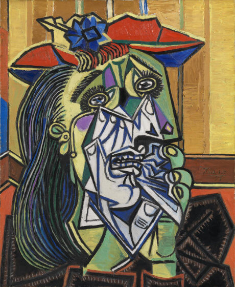
But take a look at Picasso’s painting “The Weeping Woman” above. Does that show you how a weeping woman really is, and what it should really look like (what Cubists purport to show with their art)?
Of course, Picasso’s intention all along was to shock people, by showing them a reality in a completely new level of abstraction, and got famous for it.
Art is subjective after all. An artwork doesn’t have to be beautiful, done with effort or have any meaning at all. Still, I end up questioning myself about the very meaning of art, if a new field that goes beyond traditional values automatically becomes something to value. Have you heard of “poop art”?
Anyway, let’s start reviewing and analysing Guernica, arguably the most famous Cubist artwork of all time.
Review
In early 1937, the Spanish Republican government commissioned Picasso to produce a mural for the Spanish pavilion at the upcoming 1937 Paris World’s Fair.
After weeks having an “art block”, Picasso heard about the bombing of Guernica that had happened on the 26th of April of 1937 (a few weeks before the Paris World’s Fair), and immediately found his subject.
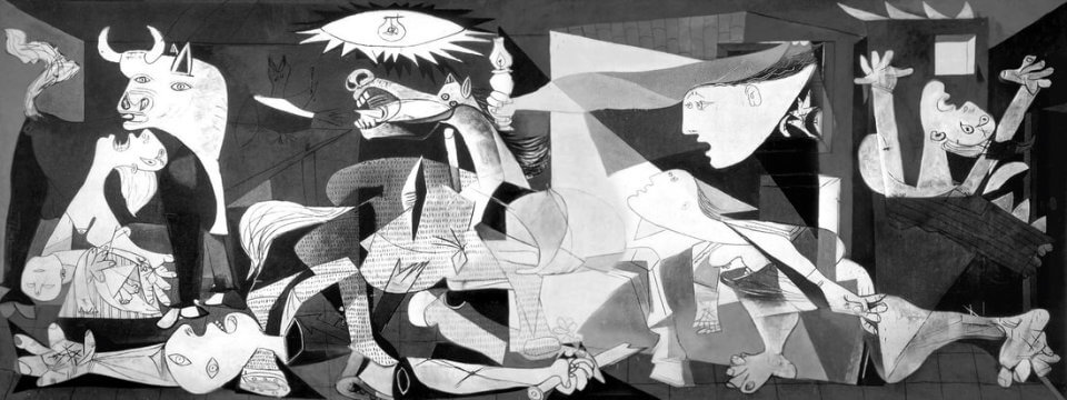
Within a bit over three weeks he had completed the job. That’s pretty impressive considering that the mural measures almost 3 meters high and 8 meters long and consists of a single canvas (as opposed to several smaller sewn canvas).
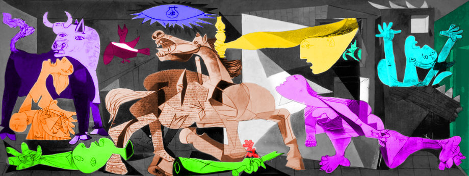
Guernica is now the most famous anti-war painting in the world, and with good reason. The emotional context assocatiated with this anti-war message is without a doubt very potent. The despair of the portrayed figures is quite expressive and the mood is unquestionably poignant. The immensely large dimensions of the painting together with the chaotic organisation of its elements was meant to dazzle viewers. And dazzled they are.
But I’ll be blunt – Guernica looks like a sloppy work to me. Picasso apparently completed Guernica in a little over three weeks, and one notices that it was a rush job (e.g., there are noticeable splashes, for example, between the teeth and jaw of the horse).
The monochromatic colour scheme employed by Picasso (technically, Picasso also used light pigments of blue and red, but most of the painting consists of grey and black) makes Guernica look quite dull to me.
I should point out that I have nothing against monochromatic paintings, quite the contrary! But seeing other (almost always colourful) cubist paintings from Picasso, it feels odd that he would miss the opportunity to go wild with Guernica.
Perhaps it was Picasso’s intention. Some suggest the use of black and grey was meant to convey pain, chaos and suffering. But, surely, wouldn’t even moderate tones of red have made the painting much more dramatic and interesting? Maybe Picasso did not wish to manipulate the viewers emotions by adding colours, as it has been proposed, but that seems a bit of a post hoc explanation.
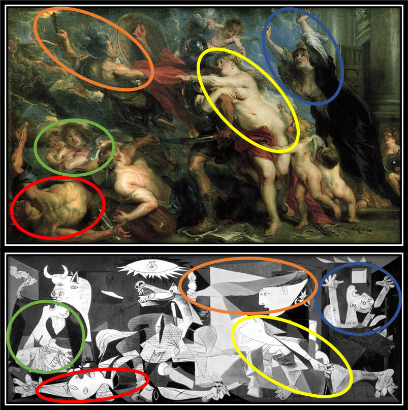
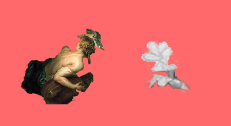
Moreover, Guernica was allegedly based on “The Consequences of War” by Rubens (and possibly others, although they won’t be covered here), a work Picasso never fully acknowledged (read more on that below).
Of course, it might be a purely gigantic coincidence that the two paintings share numerous details. However, Picasso had an allegedly encyclopedic knowledge of art, and, to make the case stronger, Rubens was one of his favourite painters! Now, how on earth would he miss the obvious similarities with the Horrors of War? Again, it might all be just a coincidence, I guess we will never know.
Lastly, you may have already figured out that that I’m no big fan of Cubism. The problem is that I find the ideas of Cubism paradoxical. Cubists thought realism was not accurate enough as a way to show how things really are. So, bye-bye perspective and graded shading, and hello distortion and disfiguration?!?
And I know Picasso was a terrific painter, that’s not the point. I’ve been to both the Museu Picasso in Barcelona and the Museo Picasso in Malaga, and I was really impressed with some of the lesser-known works from Picasso. In fact, I was surprised that they are not given as much credit as Guernica.
On a positive note, I do like certain aspects of the painting. For example, Picasso requested a specific kind of paint that would have the least amount of gloss possible. The result it that the brighter parts of the painting are very luminous, whereas the blacks are matte black.
It is also interesting that there are actually no references to the actual bombing of Guernica: there are no identifiable landmarks, or images evoking bombing, no allusions to politics or to the Spanish Civil War. Only the title suggests a connection with the wrecked town.
It is as though Picasso wished the painting to symbolise the suffering caused by any war.
Rating
I have to say that I feel very uncomfortable giving a low score to a work of art that has been praised worldwide for decades, and which is considered to be a masterpiece by many art experts.
Nevertheless, I have to stay true to my beliefs, and Guernica simply doesn’t do it for me. As described above, the distorted and graceless figures, tedious palette of black and grey and the absence of a proper acknowledgment of works that most likely inspired Picasso, really takes my enthusiasm for this work.
Here at mindlybiz I’m giving Guernica a rating of 2.
Bizarrometer
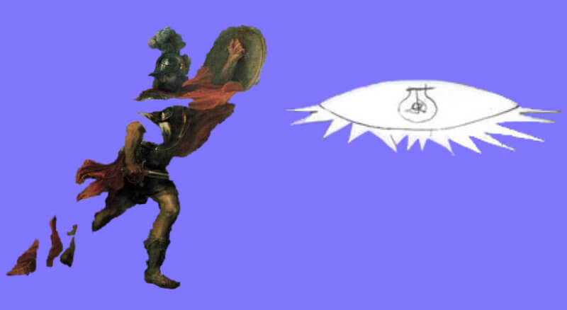
Even though Guernica is often considered to be a cubist surrealistic painting, the theme of the composition as a whole is not hard to decipher: the devastation and suffering caused by war.
There are a few oddities here and there such as the lightbulb or the woman carrying a torch, which definitely require interpretation. However, even these elements can be easily framed within the general theme of war.
For these reasons, Guernica gets a Bizarrometer score of 2.5.
Guernica (briefly) Explained!
In order to make sense of Guernica, it’s critical to learn about the political and historical context in which Picasso was living, in particular the Spanish Civil War.
In January 1937 the Spanish Republic commissioned Picasso to produce a large mural to be exhibited in the Spanish Pavilion at the 1937 Paris World’s Fair.
The Spanish Republic had been at war with the Nationalists led by Francisco Franco and his allies, Nazi Germany and Fascist Italy. The Republicans, on the other hand, counted with the help of Russia and volunteers from all over the world.
By early 1937 most of industrial north of Spain was under Republican control. Franco decided to bomb the town of Guernica, which he believed would facilitate the take over of Bilbao and eventually the entire northern region.
Picasso, a fervent anti-fascist, applauded the efforts of the Republicans in fighting off the rebels, but he was somewhat reluctant to get involved into politics and worked disheartened on the mural during the initial months. The bombing of Guernica changed that.
The horrific photos of the bombing on the newspapers galvanised Picasso into action, and he completed the work in less than a month.
The painting as a whole is rather chaotic, the figures are almost juxtaposed on one another and we see destruction and suffering everywhere. This was of course intentional, as Picasso wished to shock the viewer with depictions of chaos and destruction caused by war.
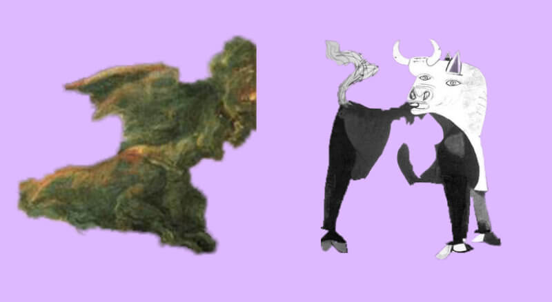
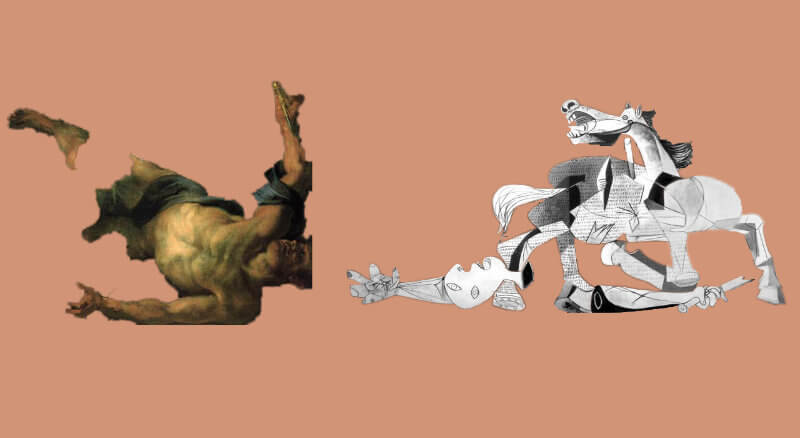
This suffering is pretty evident in the figures’ facial expressions and body postures, particularly the horse, which has a priveleged position at the center of the canvas, and which evinces excruciating pain.
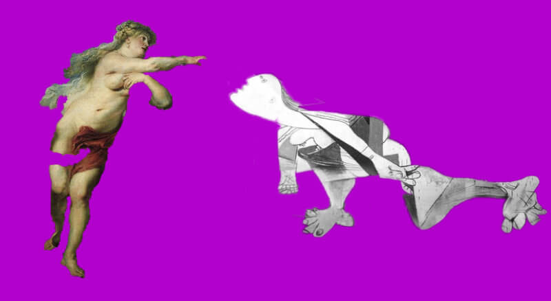
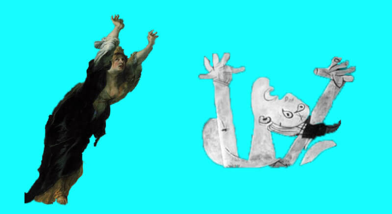
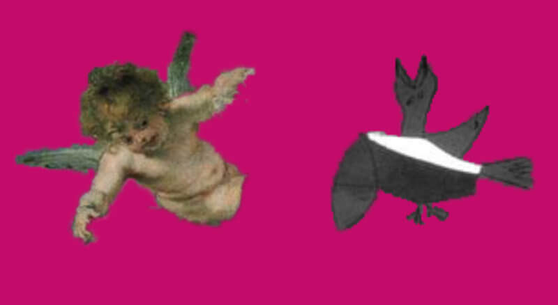
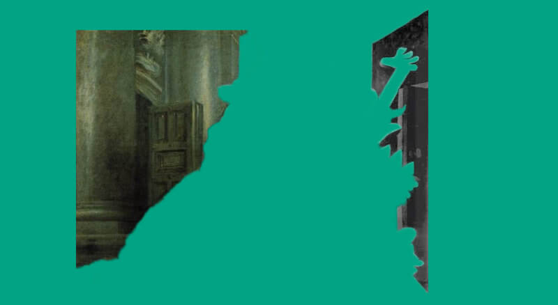
In her book “Picasso’s Guernica after Rubens’s Horrors of War”, Alice Doumanian Tankard proposed that Guernica may be based on a mirror-image of Rubens’ 1888 painting “The Consequences of War”.
This can be most easily seen if we flip Rubens’ painting horizontally as I did above.
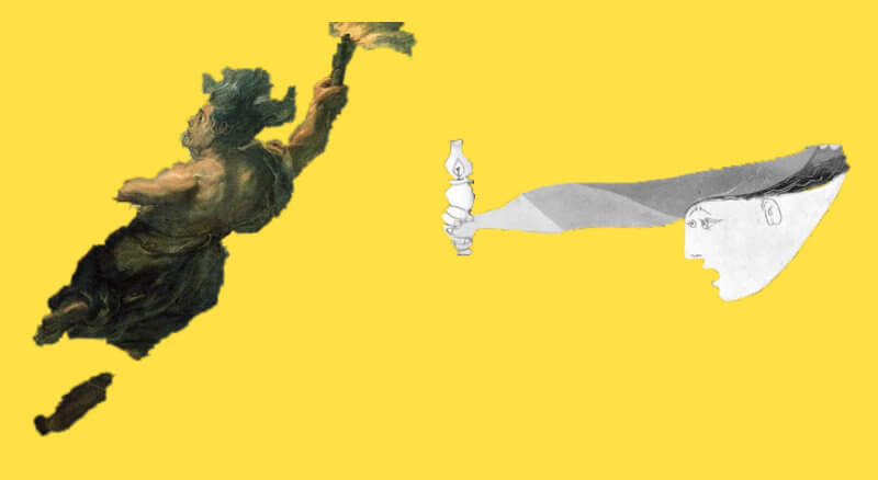
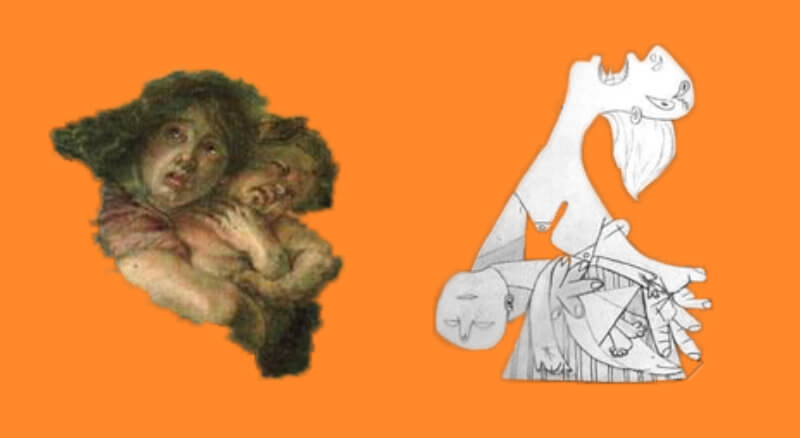
Hopefully you can see what made Tankard advance her hypothesis. Many of the figures in Rubens’ work appear to have a homologous version in Picasso’s work: For example, a woman with her arms stretched up, a woman holding a dead child in her arms, an unconscious man on the ground, a woman leaning towards the center, a woman carrying a torch, all appear in both paintings.
Picasso admired Rubens so it’s not a stretch to imagine that Rubens’ painting could have influenced Picasso. In fact, just as “The Consequences of War” was painted as a response to the Thirty Years War, so was Guernica painted as a response to the Spanish Civil War.
Obviously, differences between the Rubens’ and Picasso’s work exist. The most obvious one is the absence of Rubens’ Mars depicted at the center of his painting. Picasso chose to place the wounded horse at the center of the canvas, perhaps wishing to accentuate the agony that the Spanish civilians were experiencing in this war.
Before expounding on this analysis, as always, let me share with you some facts I learned while researching Guernica, which will be helpful in the interpretation of Picasso’s work.
Hello, I am Mohsen from Iran, I am an art teacher. I liked your article. I teach art criticism and I will be talking for a three-hour session about the aesthetics of pleasing frame proportions, geometry, symmetry, linear and black and white composition, and the many preliminary designs that went into the formation of this work. Of course, advertising was also effective in making this work visible, but this work is definitely one of the masterpieces of anti-war painting. A beautiful image of an ugliness, Picasso was able to show the ugliness of war in the best possible way. Of course, the beauty of Guernica is not in its visual appearance, but in the underlying structure of the work. I always tell students in criticism class that I may not like a style in terms of personal taste, but in the capacity of analysis, it is fair to see and express all the positive and negative aspects of a work. Picasso’s influence on Rubens, on African masks, on Eastern art, etc. does not detract from Picasso’s values, and this influence is a strength, not a weakness. Good luck. Your topic was useful to me and I thank you. My language is not English and I used Google Translate. There may be some mistakes in the written text.
Hi Mohsen,
Many thanks for your comment! As an Arts teacher, you are far more knowledgeable than I am in this respect, and your review of the work is spot-on.
I fully agree with you that, as an anti-war symbol, Guernica deserves full credit and is indeed commendable. A problem with rating works of art is that I try to evaluate them based on both symbolism and aesthetics, and, to me, Guernica falls very short on the latter. In all honesty, my feelings towards Guernica may have been shaped by the hype that often surrounds it. Countless other anti-war artworks deserve at least as much praise as Guernica, but have been somehow overshadowed by it: Nabil Kanso’s frenetic and fiery war-related paintings, Dalí’s impressive works from his Atomic period, Vasily Vereshchagin’s meticulous and haunting The Apotheosis of War, and even Rubens’ Consequences of War, all rank above Guernica in terms of overall artistic merit, in my opinion, yet are far less discussed and appreciated as anti-war symbols within the art world.
And, exactly, Rubens’ influence on Picasso is definitely not a weakness, quite the contrary (I apologise if my article somehow gave the impression that it was). My criticism was more directed at the fact that Picasso never seem to have acknowledged Rubens’ influence on his painting, even though the similarities between Rubens’ The Consequences of War and Picasso’s Guernica are undeniable (as described in my article).
Anyway, good luck with your three-hour presentation – that sounds like something I’d definitely have liked to attend 🙂
Only with a simply contrast b/w lenguage, that a child can easily undrestand, if you are a human(not you in this case).
With primeval figures in their desperation and most dramatic moments in their life and dead.
Almost like graffiti artists do in the same size today.
He brings us “The Horror of War”, but he is also warning to us.
A different war is coming.
The Spanish Civil War was reported by important journalists of the time.
This picture alerted and made the world aware of the pain and suffering that this new type of war brought with it, the so-called aerial bombardment of the civilian population.
Europe will experience it later in World War II.
For the painter it was a way of giving voice to his people and his message.
The press of those years was in b/w and the cinema too, except for some blockbusters with a very high budget.
In order to spread and raise funds for the Republican side (Defenders of democracy), against the Nationals (Franco dictatorship).
He presented his work at the Universal Exhibition in Paris in 1937.
Obtaining recognition and impact at a global level.
Those pioneers of graphic journalism of the time, in a photograph of the painting in b/w or without color.
They managed to convey the message of the painting to their readers, and after the passing of the years, it still retains the strength of its original genesis.
Whoever you are and regardless of who you are.
Thanks for your comment Cris! I think you have nicely summarised Picasso’s intentions with Guernica and the impact it had on the audience with this comment.
I admit I could have given more focus on Picasso’s sentiment towards the war, which naturally needs to be taken into account in any analysis of Guernica. I mentioned it in passing at the end of the Review section, but I should have probably elaborated on it.
I fully acknowledge Guernica’s potentiality as an anti-war symbol and this, by itself, is noteworthy; it is in fact one of the aspects of the painting that fascinates me. Unfortunately, reviewing the work as a whole, I do not think the quality of the painting is on par with the message it embodies.
lacklustre?
Inspired to inspire your deadclock imagine
Hi Cris. Yes, perhaps “lacklustre” was a poor choice of a word. But I was refering to the visual elements of the mural. To me, they simply don’t do justice to the intrinsic message of the painting, which I find profound.
However, art is subjective, and my opinion is really just that, an opinion. I tend to lean more towards classical art than abstract/cubist art, and my article likely reflects this inclination.